After rediscovering DelphiCodeCoverage, I had made a few cosmetic and functional upgrades to its HTML Report.
I have now pushed a few more rounds of upgrades for better looks and usability. In case they are not merged or you want to test run future changes, you can check my fork of the repo, though for stability stick to the official repository maintained by ekot1.
Here is a visual summary of the changes, form original state to current one.
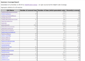
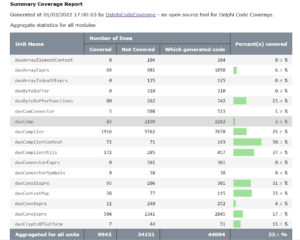
Summary report table
First the summary table, which used to be quite austere and looked like the screenshot on the left.
It is (somewhat) less gray (but still gray, heh), and has a few added features.


The usability feature are
- Columns headers can be clicked to sort on the values of that column
- A small histogram to the right makes the coverage more visible
- There is a new column with the number of non-covered lines, so you can focus on units where more work remains
- Percentage come with an extra decimal, so that small progress gets recognized
- Headers and footer are kept into view when scrolling the table
Unit coverage reports
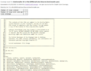
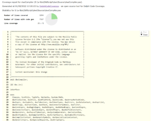
Changes to the unit coverage reports are less spectacular in a screenshot.
To the left, what it looked like, and to the right what it is looking like now. While not much change is visible in the new version, the devil is in the details.


The not-so-visually-obvious changes are:
- the little “Prev/Next” box to the right allows to quickly jump to sections that are not covered. Gone are the days of scrolling at random to hunt those last few lines with no tests.
- code display is centered, with wrapping lines, and higher display performance thanks to simpler HTML
- it is now responsive, and it can be used both on huge desktop screens and relatively tiny laptop screens on the go.
- a little pie chart a added at the top
